Many local business websites end up feeling heavier or less effective than their owners expect. Most of the issues come from small changes over time that quietly reshape the site in ways no one meant to happen. Certain patterns tend to appear again and again, especially as the business grows and the website evolves alongside it.
Why these patterns appear so often
Most websites start simple. A few pages, a clear purpose, and a sense of what the business wants to say. As time passes, the site grows in uneven ways. New ideas appear, quick fixes are added, and tools are installed to solve individual problems. None of these decisions feel significant at the time, but together they gently shift the shape of the website.
This is why so many local business sites end up feeling slightly disconnected from the business itself.
The structure no longer reflects how the business works today. Pages feel unrelated. The design starts to show its age. What began as a neat, compact site becomes a patchwork of old decisions that no longer fit together.

A practical resource where I explain how to think clearly about your website, so it feels easier to manage and better aligned with the way your business actually works.
How unclear messaging holds a site back
A common pattern is messaging that has grown vague or diluted. This usually isn’t intentional. It happens when wording is added in small pieces, or when older copy stays in place even though the business has moved on.
Visitors notice this immediately, even if they can’t explain it. They feel unsure about what the business offers, or who it is for. The result is hesitation, not because the business lacks value, but because the website doesn’t make things feel simple or obvious.
Clear messaging isn’t about clever language. It’s about reducing the guesswork.
Clear messaging helps visitors feel confident about what you offer and whether it’s right for them.
When pages slowly become overcrowded
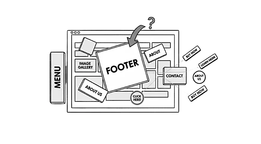
Another pattern is pages becoming busier with time. A plugin adds a banner. A marketing tool inserts a pop-up. A previous designer included a large header image. Over the years, each addition feels reasonable, but the combined effect is visual noise.
When a page has too many competing elements, nothing stands out. Visitors need to work harder to understand what matters. Even small amounts of clutter can make a website feel dated or overwhelming, especially on mobile devices where space is limited.
The intention is always good. The outcome is often confusion.
Why navigation becomes a source of friction
Navigation problems rarely appear overnight. Menus expand as the business grows, pages are added reactively, and categories multiply without a clear plan. Over time the structure becomes harder to follow, both for visitors and for the business owner managing the site.
When people can’t quickly find the information they expect, they lose confidence in the site. They may assume the business is smaller or less organised than it really is. A thoughtful structure helps visitors feel looked after, but it’s something that can slip away gradually without anyone realising.
The impact of ageing designs and outdated tools
Designs that once felt fresh eventually begin to look worn, even if they were well crafted. Fonts, colours, and layouts age in subtle ways. Old themes or plugins may no longer be maintained. Tools added years ago can slow the site down or behave unpredictably.
These aren’t dramatic failures. They’re gentle signs that the website has outgrown its original setup. Small cracks appear in the form of slow loading pages, inconsistent layouts, or features that feel clunky.
When the underlying tools are outdated, the whole website feels heavier than it needs to be.
Why small issues often hide bigger patterns
A slow page, a form that stops working, or a layout that breaks on mobile can seem like isolated problems. In reality, they often point to deeper patterns: a site built on top of old decisions, tools that no longer fit, or structural choices made years earlier.
The individual issue is rarely the real story. The real story is how the website has evolved and what it now needs to feel stable again. Understanding these patterns makes it easier to approach fixes with clarity rather than frustration.
A clearer website usually comes from simplifying what’s already there, not adding more layers on top of old decisions.
Many of these issues stem from overcomplicating WordPress in ways that feel harmless at first but create friction later.
A clearer website is easier for everyone
A clearer website doesn’t come from adding more. It usually comes from simplifying what’s already there so the site feels lighter, cleaner, and more aligned with how your business works today.
If your site has picked up a few of these issues over the years, my Build and Enhance service explains how I modernise older WordPress setups so they feel clearer, faster, and more enjoyable to use.


